

The Wednesday Home Edit: Farrow & Ball review, 2023 edition

Back on the old WordPress site, my review of Farrow & Ball paint was one of the most popular posts. Quite a few of you have joined me since I’ve switched things over to Substack, so I’ve updated the post and brought it here.
I spent most of the 2020 and 2021 lockdowns painting our house. It developed into something of a hobby - reading painting blogs, collecting fan decks, literally watching paint dry. I got very tired of painting by the end of this, although now I’m itching to pick up the paint roller again. Believe it or not, we still have a handful of paint jobs left to do.
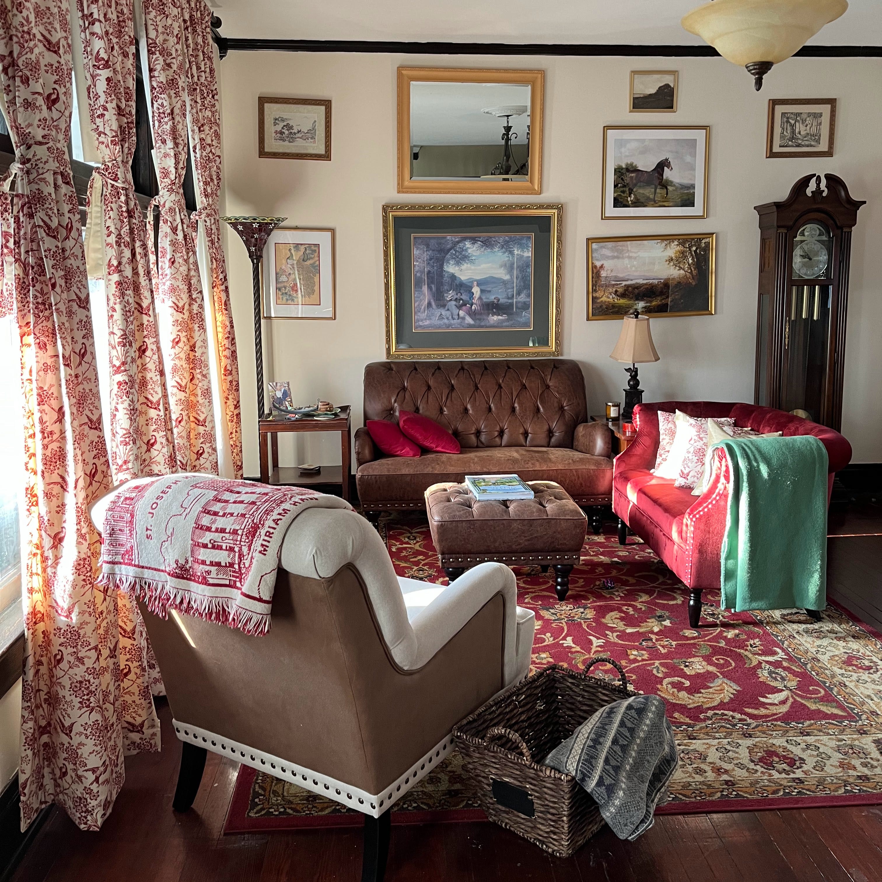
Farrow & Ball is my go-to paint. Back during the pandemic when I was on Zoom all day and painting all evening, my poor coworkers had to hear me wax poetic about a premium British paint brand. I became this SNL sketch.
In all seriousness, it’s my go-to for a reason. Painting is one of the home renovation instances when I’ll never use the budget option. Paint quality makes a tremendous difference to the overall look and feel of a home. F&B paint is more vibrant and livelier than anything else out there. Plus, I find the color selection is more sophisticated and more curated than other brands.
Back before I started using F&B, of course I was searching the Internet for things like ‘is farrow and ball worth it.’ It’s twice the price of Sherwin-Williams. That’s worth doing a little homework. I stumbled across some common caveats - the same ones were turning up in every search. Fortunately, all or most of them are untrue.
You can’t touch it up - Yes, you can, and I do it all the time. We’ve dinged the walls moving furniture and throwing toys and hanging paintings. Spackle, primer, and a touch of leftover paint is not at all noticeable. One thing they tell you never to do is use a sample pot for touch ups. This is also a myth. I’ve made plenty of seamless touch ups with a wallet friendly $8.50 sample pot. (Note that sample pots only come in the Estate Emulsion finish, so it will only work if you’ve used Estate Emulsion on your walls.)
It’s a disaster around kids/pets - Estate Emulsion (their signature chalky finish) is not the best choice for certain areas of the house. That’s true. I painted a room that was earmarked as a quiet adult sitting room using Estate Emulsion. Through the child’s right of eminent domain, that space is now a playroom. The Estate is holding up well, but I wouldn’t have done that on purpose. This very afternoon, said child accidentally splashed a full 16 oz of water across the Estate Emulsion wall as I was working out, and I think the paint has survived.
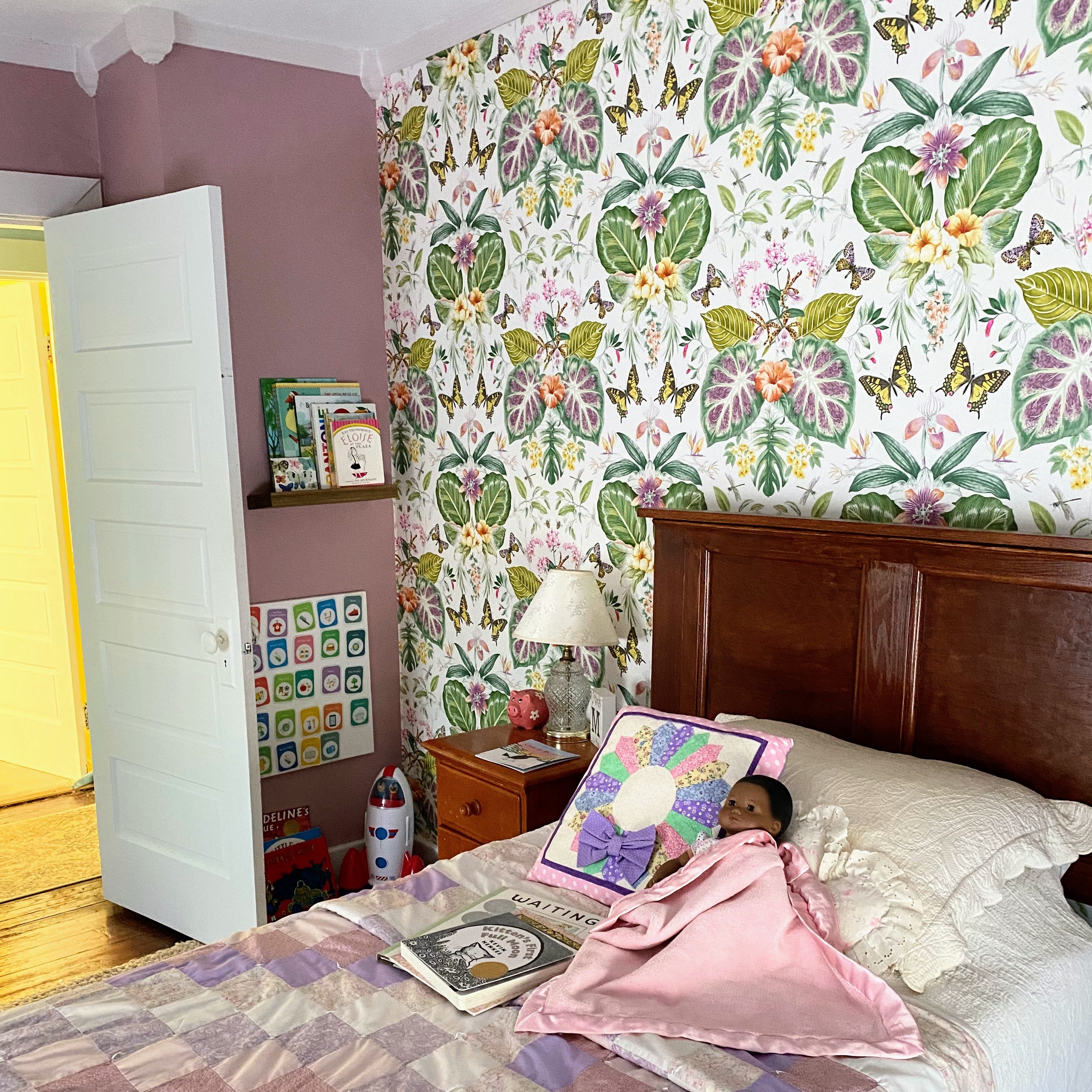
Modern Emulsion is key for high-traffic areas - our daughter’s room and the sun parlor which serves as a family room/kid art room/mudroom are painted with Modern Emulsion. F&B also has a newer finish - Dead Flat - which is both scrubbable and low sheen. I’m tempted to try it in the upstairs hallway and will post the results if I do.
You can just color match with cheaper paint - Yes and no. The real thing has more pigmentation and is made with natural ingredients, not synthetic ones. I never color match when painting large surfaces or statement pieces like our china cupboard (F&B Pitch Blue in Modern Eggshell). However, I’ve gotten excellent color matches from Sherwin-Williams. Since this is F&B, every paint on the market is technically a ‘cheaper paint.’ The key is not to use a cheap paint. S-W Emerald is a great option for woodwork, and PPG Break-Through 250 is gold for ultra-high-traffic surfaces like mudrooms and kitchen cabinets.
The coverage is terrible and you have to do a million coats - The coverage is amazing, especially if you use good quality painting equipment. I have plenty of leftover paint every time - perfect for the touch ups described above! As long as you follow the directions and use primer, you’ll only need to do two coats.
Here’s a list of the F&B colors I’ve used in my home so far - if you’re planning to use any of these and have questions, I’d be happy to help!
-Dimity (Estate Emulsion, formal living room walls) -Pink Ground (Modern Emulsion, sun parlor walls) -Pitch Blue (Modern Eggshell, china cupboard) -Yeabridge Green (Estate Emulsion, guest room walls) -Clunch (Color matched Emerald Satin, guest room woodwork) -Dayroom Yellow (Estate Emulsion, master bedroom/sitting room walls) -Wimborne White (Color matched Emerald Satin, master bedroom/sitting room woodwork) -Cinder Rose (Modern Emulsion, Child’s bedroom walls) -Great White (Estate Eggshell, Child’s bedroom woodwork) -Cabbage White (Color matched Emerald Satin, hallway woodwork)
I would strongly recommend the dead flat. I painted the area by my back door in 'setting plaster' dead flat. I have two big dogs who regularly come in and out, wet and muddy and the pale pink paint wipes clean every time without a mark left on it. The colour is also lush and the finish is perfect.